Why Might You Need Some Expert Advice on the Best Font for Resume 2018?
When it comes to submitting a resume, you want to be sure that as well as being informative and setting you apart from other candidates, that is it also aesthetically pleasing. How your application is presented can make a huge difference when first glimpsed and selecting the best font for resume 2018 is therefore crucial. Selecting the best font size for resume 2018 also plays a vital role as the person trying to read it want to be able to do so without having to squint or get lost from one sentence to the next. This pitfall can easily be avoided by enlisting the help of our resume and LinkedIn writing service who can offer experienced guidance for the latest font trends 2018.

Just as with ever-changing 2018 resume trends, fonts and their subsequent sizes are also subject to the whims of whichever department head has the trendiest blog. It is therefore difficult to find out what the actual requirements are when selecting the appropriate resume font size 2018. You could search through many online pages and each supposed ‘expert’ will give an opinion based only on their own experience. By using our services to help you, however, you can rely on receiving guidance on the best font for resume 2018 to use from experts that stay in constant communication with hiring managers to find out their preferences.
 What Are the Best Fonts for Resumes 2018?
There are a wide selection to choose from and it doesn’t really make too much of a difference which font you end up using so long as it easy to read in both print and on screen form. You also want to select one that is widely used on all computers so that the formatting isn’t affected when your resume viewed on a different system. Out of all the fonts that are currently available however, many resume and career experts (including our own), suggest the best font for resume 2018 to use when creating your job application information package are:
- Arial – a simple and very easy to read font that many people prefer. Voted as one of the favorites among hiring managers who have to read through piles of resumes on a daily basis, overuse doesn’t give you the uniqueness to stand out from a huge pile.
- Calibri – an exceptionally easy to read font that is the default choice for many word processing programs.Also used by many online web pages, it makes reading on a screen a very simple process that doesn’t lose the reader.
- Cambria – A popular choice of font for resume 2018 because so many people use it on a daily basis and a lot of recruiters are familiar with it.
- Garamond – A simple yet elegant font that adds a touch of uniqueness to a resume to help it stand out. Easy to read on paper or on a screen, this font has been a favorite for many years.
- Georgia – A traditional alternative to the Times New Roman font, it is extremely easy on the eyes and is available on just about any computer.
- Helvetica – A clean and modern alternative to the Times family of fonts, it is a favorite among many website designers and typographers. It is used by many companies to create their logos (Nestle and Lufthansa) and can be seen on New York City subway signs.
- Times New Roman – this popular choice has long been used to create documents of all sorts and remains a firm favorite in the academic world. Universally recognized, it is popular among many HR department heads as it is an easy-to-read text in any form. As with Arial however, it doesn’t give your resume the power of being ‘different’ as perhaps the Cambria font does.
Out of these choices, the most common font used is the Times New Roman, in black and at size 12 points (as demonstrated above).
Which Professional Font for Resume 2018 LinkedIn Profile Is Available?
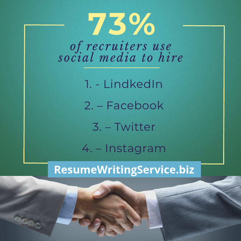
Social media is a great way in which to sell yourself and indeed, many companies now recruit people directly from such places as LinkedIn and Facebook. If done correctly, your LinkedIn profile can be a powerful tool in the search for employment that anyone can find through certain keywords. You are limited however by which fonts are available to choose from. Through research, the LinkedIn team has found that the Source Sans (Sans Serif) family of fonts is the best to view a resume online and offer them in a range of sizes. Arial is also available but only when Source Sans is not embeddable into your browser or unavailable.
Let Our Experts Help You to Choose What Font to Use for Resume 2018
There are so many requirements to satisfy when it comes to sorting through your employment documents and it can often become stressful, causing you to forget some important information that may add to your chances. Our experts are here to lighten some of that burden and can show you in a clear way what the latest font trends 2018 are and help you choose one that adds a level of professionalism to your resume. With many years of experience in successfully helping people across a broad backdrop of business and industry profiles, and a profound understanding of all the latest recruitment trends, our experts really can boost your employment chances.
